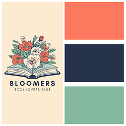
Choosing the right color palette brings your website from looking amateur to professional! There are a couple of factors to recognize first: your branding, your intent, and more, depending on your business.
Here are some tips to keep in mind while designing your Universe site:
1) 2-4 colors are best!
- I like to keep my color scheme to 3 colors: primary, secondary, and highlight color. It creates depth and visual interest without being too busy or overwhelming! Of course, your site or vision may require more or less variation.
2) Consider color psychology:
- Multiple studies show that color can influence emotions towards an object- or, in this case, a website! You want an appropriate reflection of the products, services, or information presented. When doing competitor research, observe the colors used!
3) Your logo is your beacon!
- As a rule of thumb, I like to match my graphics and fonts to my logo. It ensures my site looks clean and cohesive, even if my physical products don’t always match the same color scheme.
Below are some examples of color palettes to guide you, but use your best judgment!


